Your cart is currently empty!

What is Colour on Graphic Design?
Colour in a brief relation to Printing and Graphic Design
Colour plays a crucial role in the success of design, as it can transform a layout from dull to decadent. Understanding the different colour models and their applications is essential for creating effective designs. Here, I’m lining a brief summary about the importance of knowing the right colour models and psychology in printing and graphic design. In order that, you would understand the majority of its terms and use in graphic design. I will also include more in-depth and useful links on the footnotes below for your further reading.
The Role of Colour in Printing and Graphic Design
Colour can significantly impact the mood, perception, and overall message of a design. It can evoke emotions, convey brand identity, and even influence buying decisions. Therefore, it is essential for designers to choose the right colours for their projects, depending on the intended purpose and medium.
On The Psychology of Colour in Printing and Graphic Design
Colour is not only essential for creating visually appealing designs, but it also has a significant impact on human psychology. Understanding the psychology of colour can help designers choose the right colours for their projects, depending on the intended message and audience. We will discuss a brief psychology side of colour in printing and graphic design, as well as the different colour meanings and their applications.
The Impact of Colour on Human Psychology
Colour can evoke emotions, influence behaviour, and even affect physiological responses. It is a powerful tool that can be used to create a specific mood or convey a particular message. Therefore, it is essential for designers to understand the psychology of colour and its impact on human psychology.
- Red
Red is a bold and attention-grabbing colour that is often associated with passion, love, and excitement. It can also evoke feelings of anger, danger, and aggression. Red is commonly used in marketing and advertising to create a sense of urgency or to draw attention to a product or service.
- Orange
Orange is a warm and energetic colour that is often associated with enthusiasm, creativity, and warmth. It can also evoke feelings of caution and warning. Orange is commonly used in marketing and advertising to create a sense of excitement or to promote a product or service.
- Yellow
Yellow is a bright and cheerful colour that is often associated with happiness, optimism, and warmth. It can also evoke feelings of caution and warning. Yellow is commonly used in marketing and advertising to create a sense of happiness or to promote a product or service.
- Green
Green is a calming and refreshing colour that is often associated with nature, growth, and harmony. It can also evoke feelings of envy and jealousy. Green is commonly used in marketing and advertising to promote eco-friendly products or to create a sense of calmness and relaxation.
- Blue
Blue is a calming and soothing colour that is often associated with trust, loyalty, and stability. It can also evoke feelings of sadness and depression. Blue is commonly used in marketing and advertising to create a sense of trust or to promote a product or service.
- Purple
Purple is a luxurious and sophisticated colour that is often associated with royalty, creativity, and spirituality. It can also evoke feelings of mystery and ambiguity. Purple is commonly used in marketing and advertising to create a sense of luxury or to promote a high-end product or service.
- Black
Black is a powerful and sophisticated colour that is often associated with elegance, power, and authority. It can also evoke feelings of fear and negativity. Black is commonly used in marketing and advertising to create a sense of sophistication or to promote a high-end product or service.
- White
White is a pure and clean colour that is often associated with innocence, purity, and simplicity. It can also evoke feelings of emptiness and sterility. White is commonly used in marketing and advertising to create a sense of purity or to promote a clean and simple product or service.
Choosing the Right Colours for Your Project
To ensure the best results for your design, it is essential to choose the appropriate colours based on your project’s intended message and audience. By understanding the psychology of colour, you can choose colours that evoke the desired emotions and behaviours. For example…
- Brand Identity
When choosing colours for your brand identity, consider the message you want to convey and the audience you want to attract. For example, if you want to create a sense of luxury and sophistication, consider using purple or black. If you want to create a sense of warmth and friendliness, consider using orange or yellow.
- Marketing and Advertising
When creating marketing and advertising materials, consider the product or service you are promoting and the audience you want to attract. For example, if you are promoting a high-end product, consider using black or purple to create a sense of luxury. If you are promoting a product that is eco-friendly, consider using green to promote sustainability.
Understanding the psychology of colour is crucial for creating effective designs that evoke the desired emotions and behaviours. By choosing the right colours for your project, you can create a design that conveys the intended message and resonates with your audience.
However, It’s important to keep in mind that color psychology can vary based on a person’s background. Factors such as culture and upbringing can greatly influence how colors are perceived. For instance, the color white may be seen as a symbol of purity and holiness in one culture, but in another culture, it may be associated with mourning and sadness. This means that when using colors in a specific context, it’s crucial to take into consideration the cultural and psychological implications that they may have. For example, if you’re planning a wedding or happy occasion for a particular culture or family background, you’ll want to be thoughtful when incorporating the color white, as it may have a different significance than you initially thought.

Colour Models in Graphic Design
There are two primary colour models used in graphic design: CMYK and RGB. There is also an additional wide used spot colour system for printing and manufacturing called Pantone, as well as Hex or LAB colour system that are used for digital image processing and computer graphics. Each model has its own characteristics and applications.
CMYK (Cyan, Magenta, Yellow, and Key/Black)
The CMYK colour model is used for print materials, as it is the standard for physical printing. It is based on the subtractive colour mixing process, where each colour is added in varying degrees to create the final output. The CMYK model is used in lithographic presses, which have separate plates for each colour. This process allows for a wide range of colours and shades, making it suitable for print materials.1
RGB (Red, Green, and Blue)
The RGB colour model is used for digital designs, such as websites and digital graphics. It is also used for creating print materials using digital printers. The RGB model is based on the additive colour mixing process, where colours are created by combining red, green, and blue light. This model is suitable for digital designs, as it allows for a larger colour gamut and more vibrant colours compared to CMYK.2.
Hex (HTML)
The Hex colour system is a way of representing colours in digital media using a six-digit code. Hex colour model is used for digital designs, such as websites and digital graphics. It is based on the additive colour mixing process, where colours are created by combining red, green, and blue light. The Hex model uses a six-digit code to represent colours, with the first two digits representing red, the next two representing green, and the last two representing blue.2
LAB Colour Space
The LAB colour space is designed to replicate how humans perceive colour and it’s a technique used to quantify colours in various software, providing a vast range of colour options with each shade specified by three parameters: L for lightness, a for the green-red axis, and b for the blue-yellow axis. One of the key advantages of the LAB colour space is its device independence, which eliminates colour variation in the printing process, ensuring synchronized colour representation. Unlike other colour spaces, LAB colour space has a wide colour spectrum, allowing it to separate very close shades of colours that can be distinguished by the human eye. This makes it particularly useful for specifying and quantifying colours in the digital world, especially when converting print into digital form or when dealing with a wide range of colours. Despite not being widely used as a standard, it has important applications in various fields such as graphic design, digital image processing, and computer graphics.6
Pantone Matching System (PMS)
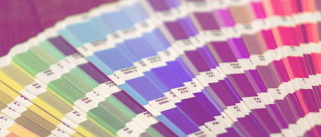
Pantone is a system for creating and standardizing spot colours. It’s used across many industries in manufacturing, which describes colours by an allocated number. The system is the standard language for colour communication from designer to manufacturer to retailer to customer. The Pantone Matching System standardizes 1,114 colours and assigns each colour a number and name. By using the Pantone system, people in different locations can refer to the same colour by knowing only the number that identifies it. This helps manufacturers and others to avoid mistakes like colour deviation between the design and the final product. Pantone colours are now largely accepted and relied upon by printers, manufacturers, marketers, artists, designers, and other.1 3
Choosing the Right Colour Model for Your Project
To ensure the best results for your design, it is essential to choose the appropriate colour model based on your project’s intended medium. For print materials, use the CMYK colour model, while for digital designs, use the RGB colour model. If you are creating a design that will be used for both print and digital, consider using the RGB colour model, as it allows for more vibrant colours and can be easily converted to CMYK for print2.
The Pantone Colour System is different from CMYK or RGB in that it is a standardized spot colour system used primarily in manufacturing and printing. While CMYK is used for print materials and RGB is used for digital designs, Pantone colours can be used for both print and digital designs. Pantone colours are almost always used in branding and have even found their way into government. The Pantone system also allows for many special colours to be produced, such as metallics and fluorescents. If a company needs to print just a couple of solid colours, like their logo on a sign, or on the cover of promotional brochures, they will often just print the solid spot colours using only the official PMS colours1 3.
Color is a major challenge when it comes to printing designs in Graphic Design. The issue mainly arises due to the varying technologies and tools that we use. Different media, such as different types of paper, can also produce different color shades. Even if you use the same paper, the color may appear different under different lighting conditions. Therefore, for manual artwork, it is usually best to be rendered during daylight hours instead of relying on artificial light for color accuracy.
1 https://opentextbc.ca/graphicdesign/chapter/5-3-colour/
2 https://www.corporate3design.com/graphic-design-101-cmyk-or-rgb-colour/
3 https://www.pantone.com/colour-systems/for-graphic-design
4 https://carleton.ca/theprintshop/story/optimize-your-designs-with-the-correct-colour-mode/
5 https://www.indesignskills.com/inspiration/colour-design-inspiration/
6 https://printpeppermint.com/blogs/graphic-design/what-is-lab-color-space-and-what-should-you-know-about-it


Leave a Reply